Welcome back to the greatest financial experiment ever. The calendar may have flipped a page. But the show must go on. Just this week the price-to-book ratio on the S&P 500 set a new all-time high of 5.15. The previous all-time high was 5.06 in March of 2000.
Yes, yes. You’re probably tired of hearing how expensive and overvalued the market is. And to that point, I saw a chart earlier this week showing the free cash flow margins of the top 10 stocks (by market capitalization) for each of the last seven decades (going back to 1954). That is, the percentage of a firm’s revenue that remains as free cash flow after you account for operating and capital expenses.
There are problems with this ratio, mind you. For example it doesn’t account for executive compensation tied to stock options. That’s especially important when you look at the top ten companies for this recent decade: Apple, Microsoft, Nvidia, Meta, Amazon, Tesla, Berkshire Hathaway, Eli Lilly, and Verizon.
These modern tech titans (mostly) are looking at free cash flow margins above 25%. Some of them have factories and make things. But the expensive factors of production–labor, real estate, raw materials–have been outsourced. The most valuable assets on their respective balance sheets are intellectual property (and cash, held in the form of T-Bills).
The ‘Nifty 50’ stocks that everyone owned in the early 1970s–before they got wiped out by the bear market in 1973 and 1974–had free cash flow margins around 5%. They DID have factories and made things. And executive compensation via stock options, linked to the stock price and financial performance (which could be improved, on a temporary basis anyway, through off-shoring and outsourcing) was not a thing then.
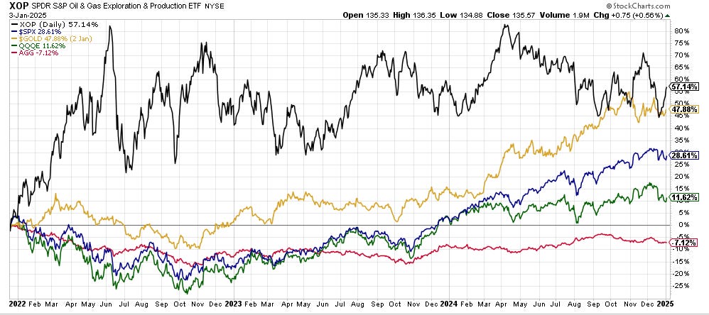
It’s a thing now, though. And here we are. We have the ten largest stocks in America accounting for 40% of the total market cap of the entire US market. And the US equity market itself, valued at around $60 trillion, making up more than 65% of the total value of ALL global stocks (Japan is second by the way, at 5.5%…making the US stock market roughly 11 times larger than the second largest market). All of which brings me to the chart below.
Investment Director Tom Dyson reviewed BPR’s closed positions for 2024 in the January Monthly Strategy Report. Tom’s too modest to say so (and he’s always trying to do better) but his strike rate (winners vs. losers) last year was excellent. We closed 24 positions last year, making money in 16 of them and using our ‘risk ratings’ and trailing stops to limit losses in 8 of them (Tom closed the position in Triple Flag on December 30th).
In the interests of transparency and accountability, this got me to wondering how our overall asset allocation strategy (beyond the stock selection) has done since inception. Inception, by the way, was December 20th, 2021. That’s when the whole BPR show hit the road. And for those of you who’ve been with us since day one (and are STILL with us), thank you! But about the chart…
Gold was up 27% in 2024 while the S&P 500 was up 23%. Way to go, gold. In fact, since Bill’s first essay on December 20th, 2021, gold is our best performing position up 47%. XOP, our oil and gas producers ETF and vehicle for Trade of the Decade, is second at 39.54% (XOP wasn’t officially recommended until January 27th of 2022, which we’ve used as the recorded starting date you could have bought at).
The S&P 500 has done fine at around 28%. But in the spirit of Christmas past, it’s the green and red lines I want you to take a close look at. The green light is QQQE, the Direxion Equal Weight Nasdaq 100 ETF. It’s up only 11% since the end of 2021. In other words, if you weighed each share in the index equally, instead of based on market capitalization, it’s been a dud.
Even MORE of a dud is AGG, the iShares Core Aggregate Bond Index ETF. AGG is 43% US government bonds, with a mix of mortgage-backed securities (MBS) issued by Fannie Mae and Ginnie Mae, other government agency bonds, and corporate bonds. We’ve had a ‘zero’ allocation to bonds at BPR since inception. The above chart vindicates that position.
But there’s an expression I like that applies here: ‘Don’t look back, that’s not where you’re going.’
Too true!
And I should also point out that performance figures can change drastically depending on your starting date. I picked December 20th, 2021 because that’s quite literally the day we began publishing our research. It seemed like the right place to start, if you’re asking how we’ve done so far.
However, if you weren’t with us then (or even if you were) the more important question now is what will 2025 bring? And how do we plan to navigate it? Both good questions! And both will play out over the year. But for this week, let’s focus on energy and continue with another chart.
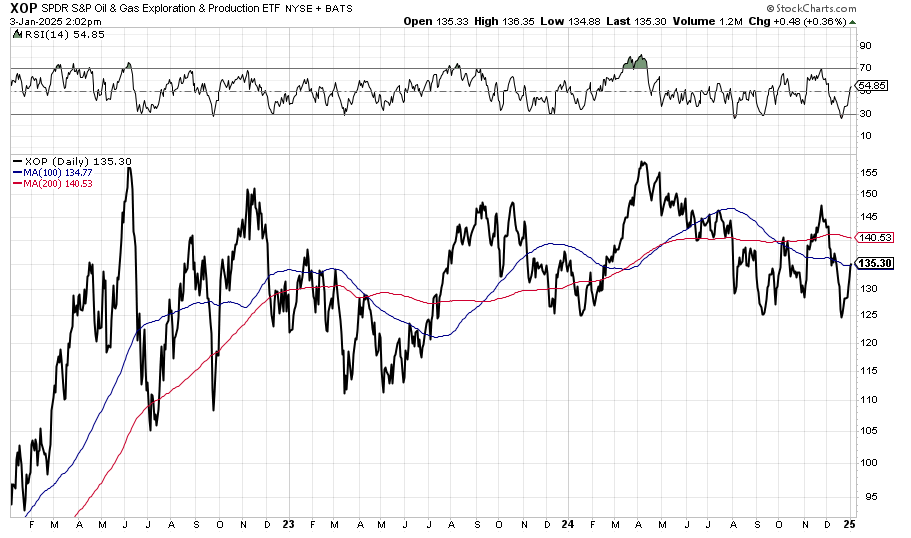
This is the aforementioned XOP over the last three years with the 100-day moving average in blue and the 200-day moving average in red. The smaller line at the top of the chart is the Relative Strength Index (RSI). For new readers, we generally recommend entering XOP when the RSI is at or below 30. Why?
Because that means it’s over-sold, at least on a short-term basis. You can see what happened in December when the RSI dipped below 30. XOP rallied hard. It’s now back up to 100-day moving average. The next bullish technical move would be for the 100-day MA to trend up and cross the 200-day MA.
The technical pattern on XOP has almost nothing to do with supply and demand for oil, though. And on the face of it, all the political news for oil ought to be bearish. For example, Scott Bessent is Donald Trump’s nominee to be Secretary of the Treasury. His ‘3-3-3’ plan to avoid recession in 2025 is to get GDP growth up to 3%, cut the budget deficit to 3% of GDP (from 6.4% now), and increase domestic oil production by three million barrels per day.
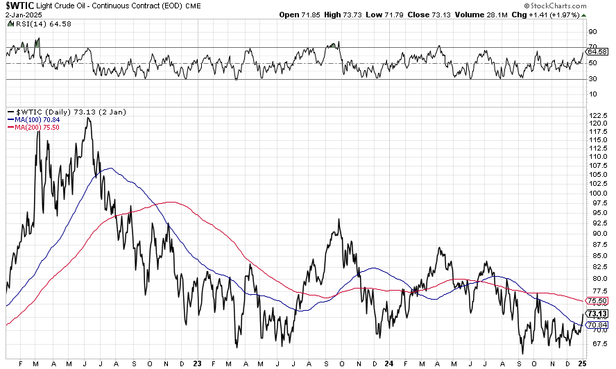
The US already leads global oil production at over 13 million barrels per day. Adding more supply without demand growth (and it sure doesn’t look like it’s going to come from China this year) ought to be bearish. But there’s what you think should happen and then there’s the chart. Here’s the oil chart.
This is a three-year chart of West Texas Light Crude Oil. You should know that oil is a heavily financialized commodity. There is also an element of speculation about the chance of a nuclear holocaust in the Middle East that goes into the oil price. Grim. But true.
But let’s assume that if it’s in the news, it’s in the price and that if it’s in the price, it’s in the chart. And let’s assume that the collective wisdom of the market has correctly priced oil to start the year. What does the chart tell us about the rest of the year?
Well, crude oil hasn’t been this high since mid-October of last year. You could argue it’s been making higher lows since early September (when the market decided Trump would win the election). But you could also argue that it’s been making lower highs since April of last year (when our Doom Index tells us we were already in recession).
Which way, barrel of oil?


